Travel is a funny thing. Despite due diligence and research, trying to control all the variables is often like carrying water in a sieve - a lesson in futility. This is not to say throw caution completely to the wind, but rather understand going into it that things will inherently be different than any preconceived ideas regardless if you’ve been there before. So, with that being said, this trip to Sri Lanka was a lesson in laughing at the weather when it should have been far less...moody and often grumpy. Maybe it wasn’t grumpy, but it definitely wasn’t blue skies and gorgeous sunsets. So, when these things happen, a bit of a change in perspective is necessary. It allows us to start thinking in a mindset that’s not really so much about “perfect travel conditions” but rather looking at the conditions and making images that play to the strengths of each situation. So that golden light isn’t there….. so what. Are we going to sulk around and whinge about the shitty weather or do we start looking for pools of light, reflections from the rain, indoor markets, texture, beauty in the mundane and decisive moments. Perhaps we need to start thinking more about how to create compelling with what’s in front of us rather than what is traditionally seen as beautiful. This is definitely a do as I say, not necessarily as I did because there were more than a couple of occasions that shook my fist at the sky and groaned at another overcast sky. We’re all human, but it’s not the end of the day if things go differently than we thought. If it was, oh man, I’d have been witness to about a million apocalypses at this point in my life.
Read Moreproduct photography
Recent Work : Cameron Foggo Design
Back at it with the amazing team at Cameron Foggo Design, we wanted to create some dynamic new images for the line coming out this summer. We built new sets, came up with new ideas, and overall had a blast shooting the new line. It’s always so good to have repeat clients so the work can evolve and improve over the course of multiple shoots. Many thanks for the trust and can’t wait until the next one. The last image is a bit of an extra as we blended ambient light with our strobes to create this evening vibe.
Read MoreRecent Work: Editorial Furniture Photography for Spazio Bressan
Something must be in the water. In the last few shoots, we’ve been given a metric ton of creative control and while that’s incredible, to whom much is given, much is expected. We were tapped to create some editorial style images for furniture designers Spazio Bressan and after just a short chat, it was pretty clear we were going to have some fun with this one. Hard light, shadows as compositional elements, graphic…all the good stuff. Immediately excited, I ran off to start creating mood boards. With the new AI tools at our disposal, we are no longer limited by searching for reference images. We just create them ourselves. Midjourney is an absolute game changer when it comes to this process. Even if we aren’t explicitly copying others work, “inspiration” can often influence work a bit more than photographers like to admit, so being able to type in the chaos that’s in my brain and have something distill it into something in the ball park of what I had in mind is incredible. In any event, I absolutely love creating images like these and cannot wait to shoot the next campaign for them.
Read MoreRecent Work: Furniture Photography for Totem Road
Totem Road, based out of Sydney, recently tapped us to create some fresh images for the upcoming release of their new line of furniture. Totem Road’s aesthetic is bright, airy and coastal, so we wanted to create some super clean images that reflected that beachy, cruisy vibe. In the past, their visuals were shot in a natural light studio, but I had other ideas.
Read MoreRecent Work: John Lyle Design
Recently, the good people at John Lyle Design tapped us to make some images of their incredible furniture. After a visit to their workshop and watching the artisans craft these pieces, we knew we had to make some super clean images to showcase them the way they deserved. We had two looks - one on a white background and one with a bit more mood to it to differentiate for the multiple channels they’d be used. We opted for pretty simple lighting setups with a single key and a fill to carve out the angles. We bounced some light with some white cards and cut some light with a flag or two, but nothing super complicated as far as lighting is concerned. To achieve the two different looks, we adjusted ratios for the, but kept light placement the same to maximise the efficiency of the shoot.
Read MoreA Study in Focal Lengths with Product Photography: Which one yields the best results?
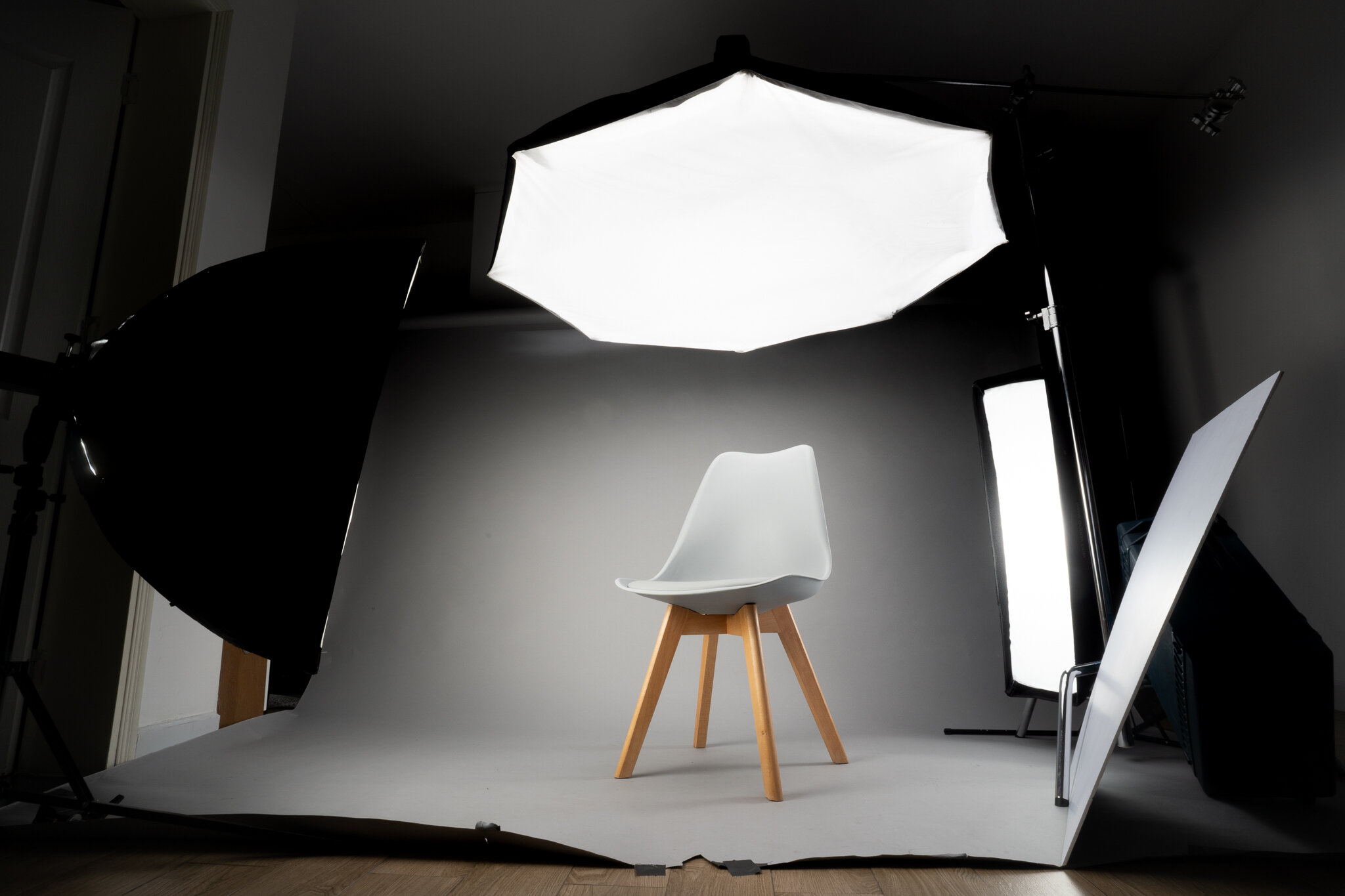
I’ve been mostly shooting small objects recently and 9 times out of 10, I’m using my Sony 90mm 2.8 macro. Incredibly sharp, I can get up close and personal to capture all those fantastic little details in product and food photography. When shooting bigger objects, I have a bit more leeway in my choice in focal lengths. Depending on the style I’m going after, I can opt to shoot super wide for a more editorial or advertising feel or I can shoot with a longer lens for catalogue images. It’s not really a matter of what’s right or wrong, but it is rather interesting to see the effects of different focal lengths in these types of shoots. I shot this super slick chair with 4 different lenses in 4 different focal lengths - Zeiss Batis 18mm, Sony 35mm, Sony/Zeiss 55mm and Zeiss Batis 85mm. All amazing lenses, so optics weren’t much of a variable, and I shot them all at f/16 to make sure the chair was sharp from front to back.
Read More


